
Logo is an important thing in today's business world. Just by looking at the graphic, you can understand the story behind it. Logos can be divided into several categories
- Combination mark logos
- Wordmark logos
- Lettermark logos
- Monogram logos
- Letter form logos
- Symbol or pictorial logos
- Abstract logos
- Mascot logos
- Emblem logos
- Letters inside shape logos
- Negative space logos
- Dynamic logos
- 3D logos
1. Combination mark logo
As I mentioned before, a combination mark logo is a visual and a word in a composition together. You’ll see throughout this guide that there’s no one type of combination mark, they’re actually a combination of many of the others. That’s why these logos are the most common, they have infinite possibilities and are super practical.
In a combination logo, the visual component can be on top, to the side or even below the wordmark. The best combination mark logos are the ones that can be used separately and still be 100% recognizable.
2. Wordmark logo
Wordmark logos are second in line when it comes to common uses, and they make up half of almost every combination logo. For a logo to be considered a wordmark its visual must be made up of the brand name in stylized letters.
To create a wordmark, start by writing the name of your brand and then trying it out with different fonts. When you find the font you like, it’s up to you to customize the letters individually. Taking the time to customize the letters in the word is what makes the difference between a logo and your brand name typed out in a nice font.
For example, give the letters a sense of personality; add ligatures, turn the dots on the i’s into shapes, make the t crosses longer, the y’s curvier, etc.
If you choose a wordmark logo for your brand, you might not need a combination mark, but you might need a symbol, mascot or letterform for when you require using a smaller version of your logo.
3. Lettermark logo
Lettermark logos are the best choice if your brand name is long and composed of more than two words. A lettermark logo minimizes the length by using the initials of each word and creating a group. In some cases, the letters will sound like a word. NASA is an excellent example. NASA stands for National Aeronautics and Space Administration, but nobody calls it that.
Other examples that don’t sound like words, like NPR and TNT, are read as each letter one after the other. Lettermark logos also work as part of a combination mark in the same way that a wordmark can.
When creating a lettermark logo, try using design aspects that will stand out and make your logo more noticeable. Use different colors, varying sizes of text, or add shapes or lines to give the logo personality. Remember to always reflect your brand values and story.
4. Monogram logo

Monograms logos are similar to lettermark logos. But they do have a noticeable visual difference. Both logos use the initials of the brand name to make up the design, but monograms interlace the letters instead of having them side by side or top to bottom.
A monogram is reminiscent of the way a family name is embroidered on linens or etched on silverware. This style of logo has a generalized perception of luxury or exclusivity. Although there are exceptions like many sports teams and some sports brands.
A monogram logo works best with brand names that have no more than three words. Since the letters are intertwined with each other, it needs to stay legible and easy to understand. Choose this style of logo to minimize the variables when it comes to visual branding.
5. Letterform Logo
Letterform logos are another type of logo that includes letters. In this case, only one letter. This style of logo is perfect for brands that appreciate simplicity. For a letterform logo to stand out, it’ll need a high dose of personality and form. Just a letter on its own won’t be as memorable.
Brands need logo variables to use on different platforms and touchpoints. A wordmark with a letterform variable covers all the possible eventualities that a logo needs. From business cards to favicons and app icons.
App icons on a phone screen compete for attention. If your app uses a visual that doesn’t resonate with the brand or is hardly recognizable, users will have a hard time finding it. Letterforms are great for app icons.
6. Symbol or Pictorial logo
Symbol logos —also called pictorial logos—are made up of graphics that visually represent the brand name or function. These can be icons, illustrations or shape compositions that are instantly recognizable as something specific.
For example, Twitter has a bird symbol, Shell has a shell, Dropbox has an open box. Finding an icon that can visually represent your brand name or brand story is relatively easy. The trick is in adding that extra bit of personality, that touch that makes it unique.
That’s how the Twitter logo becomes the Twitter bird, the Playboy logo the Playboy bunny and the Apple logo the Apple apple. These are the easiest types of logos to get right, all you need to do is make yours unique and relevant.
7. Abstract logo
Abstract logos are like symbol logos gone rogue. Instead of visually depicting a brand name or brand story, an abstract logo goes in a different direction. In some cases, it can start off as a symbol and then transform into an abstract visual and other times the abstraction is born on its own.
To create an abstract logo, you need to fully understand the purpose and story behind the brand. You won’t be able to come up with an abstract logo unless you know what story you want to tell. Think of it as a tattoo, you don’t want a logo that has no meaning or story behind it.
Even if your abstract logo has a couple of shapes next to each other, what does each shape represent? What does the composition of the two shapes together mean? Yes, you can make up the meaning of your abstract logo, after all, it’s abstract.
8. Mascot logo
Mascot logos are fun and personable, but also limited. Not every brand will benefit from a mascot logo. How do you know if a mascot logo is right for you?
If your brand story involves a person or a unique personality, a mascot logo might be the right option. Mascots can be illustrated or simplified renditions of the brand’s ideal customer or who the customer aspires to be.
In some cases, the mascot is the company founder or someone that influenced the birth of the brand. In others, it's a fictional character that’s meant to inspire the consumer to be interested and engage. The first mascot logo of this style was the Michel man from Michelin.
Remember, though, having an animal in a logo doesn’t mean you have a mascot logo. The mascot needs to have personality and a story behind it. Take advantage of this angle by using the mascot in merchandise design and product manufacturing, like plush dolls and figurines.
9. Emblem logo
An emblem logo is a contained design that includes all the elements inside an emblem shape. Brands that use emblem logos hardly ever have other logo varieties, but might have simplified versions of the same emblem.
Emblems make great labels, pins, bottle tops, or anything where the logo needs to fit in a small space. They’re also memorable and interesting. An emblem can be as simple as a couple icons and a lettermark inside an interesting shape, or as complicated as a custom illustration with a lot of detail.
Choose an emblem logo if you want your brand to reach legacy levels. A well-designed emblem logo will be timeless, sleek and worth making stickers with. Use text effects to make the words stand out and good contrast between shapes and letters.
10. Letter inside shape logo
Similar to an emblem but not quite are the logos that are words inside shapes. The difference between them is the level of complexity. You could say that an emblem is to a combination mark what a letter inside a shape is to a wordmark.
The idea behind this logo style is to give a wordmark—or lettermark—that extra something to make it stand out from the rest. The shape can be anything, as long as it matches the purpose and story of the brand.
When considering a letters inside shape logo, think of what shape could possibly represent your brand. Since the options are infinite, there’s no limit to what you can do. For example, Domino’s Pizza is a domino, and Pfizer resembles a pill. Give your logo a backstory by using a shape that supports it.
11. Negative space logo
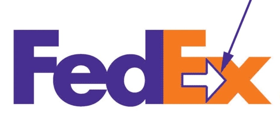
Negative space logos are a unique creative option for any brand. The visual idea of negative space is to use empty areas to depict a symbol, shape, or graphic. It can be a subtle effect or a very clear one, that depends on what you’re aiming to achieve.
Generally, negative space logos consist of two visuals, the one that surrounds and the one that is encased. The encased shape is the one denominated negative space. There’s no limit to what shapes you use to create the negative space effect. It can also be a letter and a shape, or even two letters.
For a while, negative space logos were just a trend, now they’re timeless. In fact, in 2022, a negative space logo went viral. A designer used the M of the brand name, cut off a piece and ended up with an animal shape inside the letter. People called him a genius
12. Dynamic logo
A dynamic logo is basically one primary logo that can be adjusted or customized in endless ways. Some dynamic logos, like the logo for the City of Melbourne, change color but keep the shape the same. The logo for OCAD University is more about adding elements onto the foundation design.
Not every brand is broad enough to deserve a dynamic logo. It really only makes sense for a large brand that has enveloped other smaller brands, that reaches a wide diversity of people, or that will be showcased in different places.
The best part of a dynamic logo treatment for your brand is that you don’t necessarily need to start there. As your brand grows and your logo becomes more recognizable, then you can start adding dynamism to it. Add a gradient or a pattern to where it’s usually one color. Make it match other elements around it. Bring it to life.
13. 3D logo
Give your logo an extra layer of uniqueness by making it three-dimensional. Make the letters of your wordmark pop out of the page, make your emblem look like it’s made of metal, or the shape around your brand name look like a real object.
Creating a 3D logo involves a few specialized design skills. You’ll need to add perspective, shading, doubling up on shapes and some highlights in just the right places. Just like emblem logos, 3D logos will need a flat variation for use on touchpoints that won’t fit a 3D version.
Three-dimensional logos look great when they are flat designs with touches that rick the eye to think it's 3D. But they look even better animated and rendered to look like they really are 3D. Another option is to take your current logo and make it 3D. But if you follow the industry trends, you’ll go in the opposite direction.
Any problem contact us Whatsapp